

Wednesday, October 14, 2009
HOT OFF THE PRESSES!!! FABRIC!!

 Oh my gosh, you guys! I'm so super excited about this stuff. When I was opening it last night after a long rainy and cold day, I actually started jumping up and down. Holy crap this stuff is awesome!
What is it, you might ask? It's bona fide 100% cotton quilting and upholstry weight fabric OF MY OWN DESIGNS. I took 2 of the drawings from our 2010 calendar and colored them in Photoshop, then sent them off to Spoonflower. Most genious idea ever, that Spoonflower.

 Of all my skills, I think photoshop might be the most valuable. And my enormous arm reach (but that's more of a side effect of ginormousness than it is a talent). But seriously, I can do just about anything given Photoshop and a scanner. It's so much a part of my way of thinking that I sometimes fo to hit "command+z" in real life, only to find out that I'm not actually able to do that when not on the computer.
I colored these puppies to my heart's content, and then fiddled with them to make sure they would tile correctly. For the garden one, it really hurt my brain, but I think I have the process down now.

I created a login on Spoonflower, ordered a yard or so of each, and 2.5 weeks later, there I have it!! Amazing! It's a little expensive---$18 for a quilting yard, $32 for an upholstery yard, but that's okay. It was totally worth it when I got my package and those bright, saturated hues showed up exactly like I had seen them on screen. There are all these tutorials about how the colors show up purple instead of blue--but in my case, they look totally fine!

Did I mention I'm super excited!?!?!
Labels: design, drawings, fabric, printing
Tuesday, June 23, 2009
Mad printing is happening
The sad thing is, I can't show you moste of it. I feel it would be unfair to post wedding invitaions on here before they get mailed out. I have 2 on the drying racks right now, though so stay tuned!
I did print some cards with a new logo for my etsy shop. I will use these as inserts that go with orders. I just love the teal on kraft paper.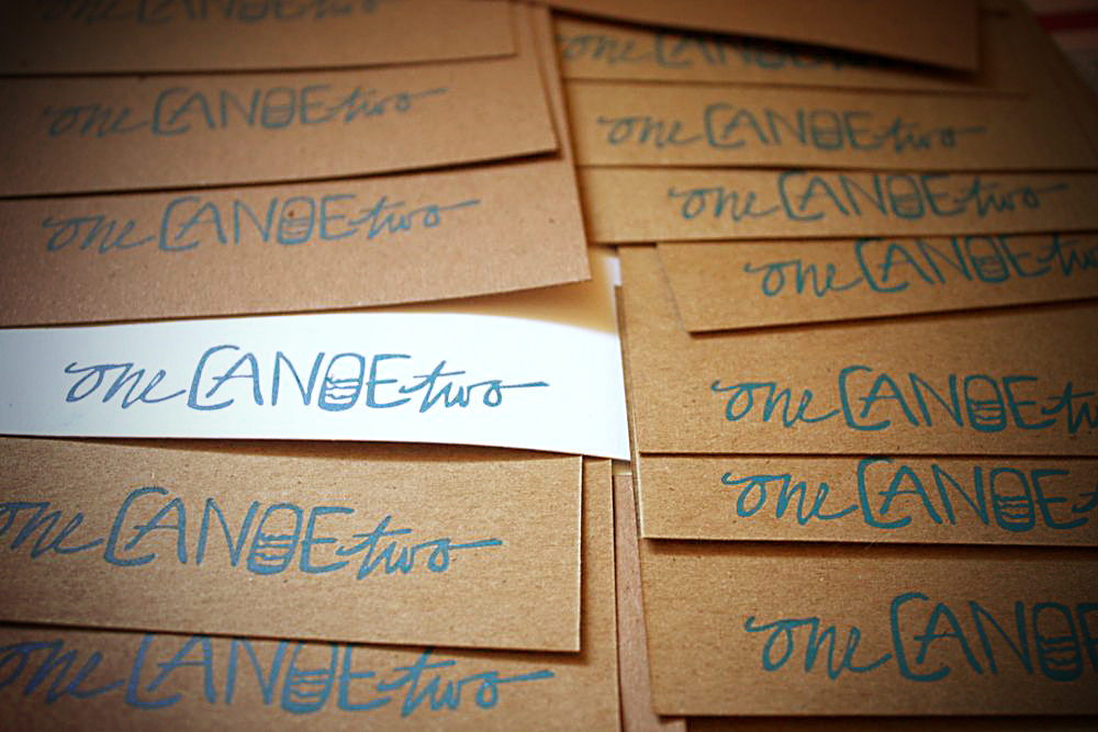
I'm off to the big city of Philadelphia for work for the next couple of days. I'm so excited! I'm going to have Starbucks! I've broken the only-on-Fridays habit of my Nashville days, but I haven't had any for 10 months!!! Mmmm.
Tuesday, May 19, 2009
Fun with Fotoshop


I have been playing with some fun trick in Photoshop.
First, this sharp focus on the central figure (Moi) is one from tilt+shift. (More info on what it ist here) I think they're just using the gaussian blur and making a mask over the parts that should be sharp. So I did this by hand in Photoshop.
Steps:
1) Make 2 new layers
2) On the top most layer, make it very blurry
3) On the middle layer make it somewhat blurry (technical, eh?)
4) On the top layer, click on the mask button at the bottom of the layer palette, use the gradient tool on "reflect" and make the middle area of the mask black (this is the part that will be sharp. On this layer, you want the black area on the mask to take up about half of the page, right in the middle.
5) On the middle layer, make another mask with the gradient tool, and make it very narrow.
That's it! I know that probably wasn't a great tutorial if you're a photoshop newbie, but it's a start.
Second, I used the warm up action from Pioneer Woman. Have you guys seen her website? Holy crap! It's beautiful, simple, has food, recipes, and humor. And she gets like THOUSANDS of comments on posts. Why haven't I seen her stuff come up on any of the craft blogs I read?
p.s. I apologize for the title of this blog. It's one of my hugest pet peeves to make any two phonetically similar words be spelled with the same first letter. i.e. Karol's Krazy Kutz. HATE THAT.
Labels: design
Wednesday, April 22, 2009
Some design work
I've been doing some design projects for friends of mine in the last couple months, and saving the money as an Ikea fund. I thought I'd show you some here. I can't remember if I've put them up before or not, so forgive me if you've already seen them!
I have the hardest time with logos. It just hurts. And there is no fast way for me to do them. It's a minimum 30 hour process for me to get anything creative at all.
----------------------------------------------------------
First off is Pinnacle Healthcare Staffing. I also did their website, without the aid of Dreamweaver or anything. Painful process. I seriously need to take some web design classes.
----------------------------------------------------------
Then we have the BookFool.com whom I've done tons of logos for in the past. This go round, I desinged at LEAST 100, and in the end, they didn't use any of mine. The one at the very bottom is the final, and I actually like it quite a bit. It was just SO HARD to come up with all those logos, I handwrote over 50 lettering styles, and in the end it was just an exercise for the client. It stung a little, I don't mind saying.
This is the final:
----------------------------------------------------------
And then there is my mom's shirt design. She's a dietician, and her professional eat-righter do-gooder organization needed a new t-shirt, but now I think they may use this for their logo. I couldn't find the nice version not on a t-shirt, but you get the idea.
----------------------------------------------------------
Here is my friend Amy's logo. I really love how it turned out. I especially liked working with a female business so I could make it slightly girly. And I love floral stuff, so this was awesome.

Labels: design
Thursday, February 19, 2009
What I do at work all day

I realized I haven't really said anything about my new (now 6 month old) job on the blog. So here's a rundown: I'm the art director for Farm Journal Magazine. We have a circulation of around 450,000, which seems like a lot to me. This is my first job in magazine, though, so I don't really know the circ numbers for anything else.
I take the stories given to me by the managing editor, then I look for photos, or adjust the photos provided, layout the page, and send it back to Katie, the managing editor. We publish around 13 magazines a year, and I probably layout around 30 pages for each issue.
I LOVE layout design. I find logo design so very very hard, but I could sit an tinker with layout for days on end and be happy. So the job suits me pretty well. The long hours this winter almost killed me, but I've been told numerous times that the summer is much much more laid back. I think I'll believe that when I see it.
The scariest part of the job is that I'm the last one to see a story before it goes out the door, and I never feel like I'm enough of a perfectionist to be doing that. It's a real struggle to be that anal retentive for me. But I try!
This is something I'm particularly proud of--I actually drew and watercolored this illustration. We didn't have any visuals for the story about a researcher making a discovery in the sour milk from his fridge, so I drew it! And you know I'm not really a very good illustrator, but I just went for it, and I love the way it turned out.
You can even see my name on the credit! My married name. Still not used to it.
Thursday, January 29, 2009
BLURB Book in the Making

I've been stuck about how to create our honeymoon photo album. I know I'm going to do it through Blurb, of course, (like our wedding album here) but I don't want it to look just like every other vacation book--at least not on the cover. Inside the book I want the pictures to be big and plentiful. Just like I like my women..uh, wait.
I think I've mentioned before that I would LOVE to do book design, and how do you get good samples of how great you would be if you don't make books? I'm taking this honeymoon book as a challenge and a chance to create a great sample of my design work potential.
So last night I googled "best book cover design" And I found this website, which isn't plentiful in posts, but had a plethora of good ideas. I was actually to the point of thinking: Okay, so I just need to create a frame of some sort around one of the photos from the book and put some type on there. But after looking at that website, I felt challenged.
So all of these photos are the pieces leftover from my scissors and xacto knife frenzy for the front cover. Here below is the rough draft. I didn't plan it this way, but the colors are actually my wedding colors!
Here are questions I'm asking myself about where to go next:
1) Should I go through and change the colors of the individual letters and objects like I planned originally or leave them?
2) Should I make it look more graphic, and less photographic? (As it is, I put these on the scanner bed without the top closed so I could get a nice shadow)
3) Does it look too childlike? If so how to tweak it?
4) What kind of design parameters does this set out for the inside of the book?
5) Do I need more elements or more negative space?
6) Is there anything I'm missing, and will it look dated in 5 years? (With everything with the wedding, I obsessed about looking dated--you know, like those 70's weddings we all laugh at. It's probably inevitable at some point, I suppose)
Feel free to weigh in!
Here is one of my inspirational images--I love that pinwheel, and all the colors, so that's why I'm torn about changing colors on the cover page. (From this AT post)
Labels: design, weddingness